The autoreload extension is already loaded. To reload it, use:
  %reload_ext autoreload
(Visual) Causality Analysis with MacroStat#
This section of the documentation is dedicated to the causality module of macrostat, whose purpose is to provide simple means of building a (weighted) directed graph of the interrelations of different variables, parameters, and scenarios in a model. The inspiration for this comes from Fennell et al. [2016]’s article “Is It Possible to Visualise Any Stock Flow Consistent Model as a Directed Acyclic Graph?”
The Causality Module#
MacroStat’s causality analysis is based on a core CausalityAnalyzer class together with specific child class implementing different variations. At the time of writing, the implemented class is the DocstringCausalityAnalyzer that relies on the inclusion og “Dependency” and “Sets” titles in the docstrings of the function methods
Docstring Causality#
As the name implies, the DocstringCausalityAnalyzer bases its analysis on the model methods’ docstrings. Specficially, it checks for each method called by the .step() method of a given behavioral class, the submethods docstring for the “Dependency” and “Sets” section to construct an adjacency matrix with ones for each dependency per sets, and zeros otherwise. To illustrate this, let us consider the model SIMEX
from macrostat.models import get_model
from macrostat.causality import DocstringCausalityAnalyzer
Using the analyzer is straightforward: supply a given model class and execute the .analyze() function to compute the adjacency matrix
ModelClass = get_model("GL06SIMEX")
analysis = DocstringCausalityAnalyzer(ModelClass)
adjacency_matrix = analysis.analyze()
Fennell et al. [2016] note that all SFC models should be representable by a directed acyclic graph. By construction our graph is directed, but to test that it is also acyclic, we have implemented a method in the Analyzer:
cycles = analysis.check_for_cycles()
print(f"Found {len(cycles)} cycles in the model")
Found 0 cycles in the model
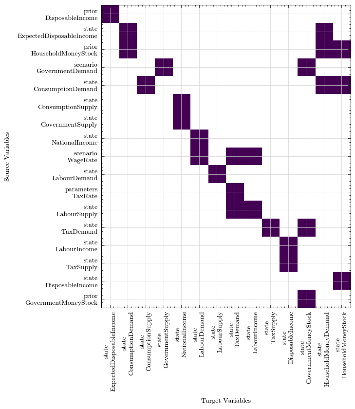
To get a feel for the adjacency matrix, we can plot it as a heatmap where the y-axis represents the source, and the x-axis the target. In other words, for the state variable on the x-axis the coloured squares indicate it depends on the relevant y-axis item. The heatmap is sorted by trophic levels, which is the reason it has a y=x appearance that can be read from left to right and matches the model description.
fig, ax = analysis.plot_heatmap()
Most of the further plotting and analysis functionality is open to extension by interested contributors. There is one further function plot_with_cytoscape that generates an interactive graphic with a network graph (also sorted trophically) of the given model